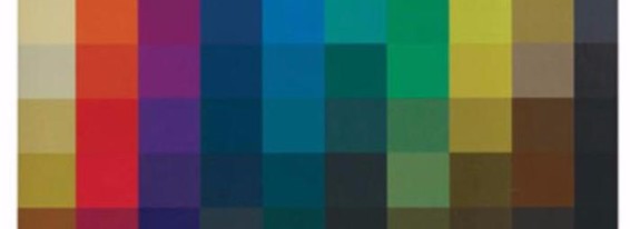
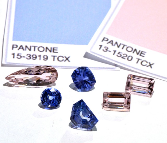
ROSE QUARTZ AND SERENITY 2016 COLORS OF THE YEAR
I’m a lover of traditions. Somehow, I think they ground me to who I am and what I care about. And whether they’re cultural, religious, or personal, traditions are comforting to me as well as being meaningful and joy filled. This is also true of work traditions. One tradition I look forward to every December, and think about during January, is Pantone’s announcement of their color of the year. This year they really surprised me. For the very first time Pantone has released two colors together, Rose Quartz (a pale, soft pink) and Serenity (aka, pale blue), pastels so vastly different from last year’s deep Marsala.
I’ll be honest; these colors felt a little reminiscent of the 1980’s Dusty Rose and Williamsburg Blue, just in a lighter color pallet. They even echo back in time to a child’s nursery in Victorian London, in the late 1800s. Although both were current and wonderful at that time, neither are something I would want to currently replicate; together the colors feel very limiting. It wasn’t until I looked at the two colors not as fraternal twins forever identified as one, but as individuals with their own distinct personalities, that I was able to see the many possibilities.
LIMITLESS: THE CHOICE IS ALL OURS
What is so different about this year’s pastels from last year’s bold Marsala? The difference can be summed up in one word…limitless. Marsala was limit-ing, a little went a long way and you could easily overdo the red because it’s such a strong color. With Rose Quartz and Serenity, on the other hand, you don’t have to be so careful, leaving a lot more room to play. Since they’re not so overpowering, I see myself taking a lot more liberties and using more patterns in fabrics and rugs. Because they are in a softer color pallet, you can use more of them in a single room or even several rooms. I’m also thinking about how well they’ll work together in different scales-large, medium, small; I can even see myself pushing an edgier look, using two large scale patterns in the same room instead of just one. The beauty is that you can have a room full and it will still be understated….limit-less.
PAIRING: WHOSE COMPANY DO THEY SEEK?
In an entire home, or in a specific room, pairings bring depth and give us different levels of focus which increases our ongoing enjoyment and engagement, wherever we are in our home. Rose Quartz and Serenity lend themselves to some wonderful pairings — with beauty, with elegance and with remarkable ease.
Pair Rose Quartz with taupe, or Rose Quartz with grey. Both are great combinations that are handsome and timeless in any room, and will hold their weight through the years. And if you know me, this next pairing will not come as a surprise: navy–all day long–with Rose Quartz. Simple…sophisticated…classic. For me that’s always an underlying value. What can I say? I don’t want a room that’s here today and gone tomorrow. While I like to have an awareness of and certainly pay attention to trends, I don’t like fad design. It’s too much of an investment for my clients and I’m not willing to invest their money in something that will be over and done with by next year.
And let’s not leave out my quiet friend, Serenity. Pairing cream with Serenity stands all on its own. And Serenity with a soft buttery yellow, or a very soft lemon tone, can also be so beautiful, but “soft” is the operative word here. You don’t want it to overpower the blue. And If you find yourself drawn to Serenity, but are looking for a more masculine feel, go with taupe, maybe giving it a little nudge to deep taupe for that handsome feel.
COLOR: THE PSYCHOLOGY
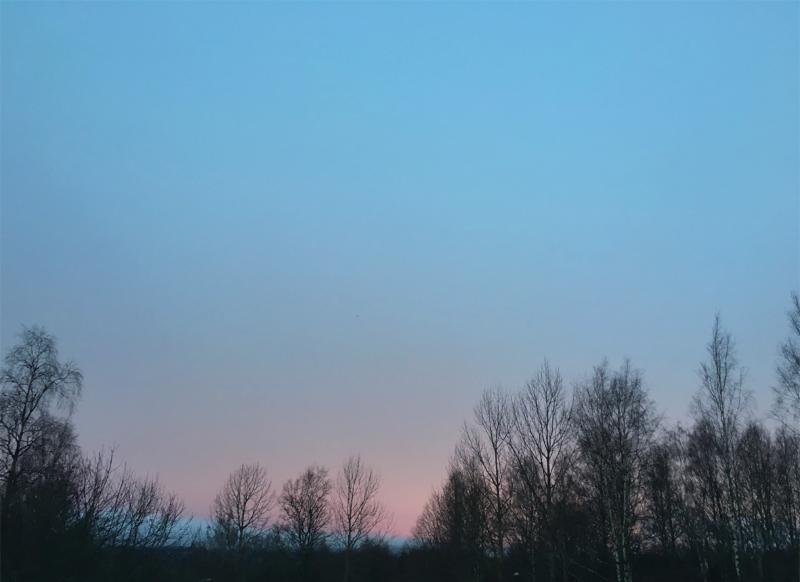
One final thing to remember about color is the psychological impact and how it makes us feel. It’s hard to beat a beautiful sunrise! And in our world, where there’s so much confusion and unrest, these pastel color choices can offer a welcomed reprieve from all the chaos. Any colors that can lead me to a state of well-being in my wonderful yet hectic life, well…count me in!
But in design, one of the most important things to me about the color of the year is being able to recommend it. I must first like using it, and with Rose Quartz and Serenity, I do! In my work, these two make me want to go out and experiment, to play and do something new. And beyond my work I like to incorporate fresh colors in my wardrobe. This year’s Pantone picks make me want to get a Rose Quartz jacket and pair it with some charcoal gray pants, and of course I’ll need a new scarf – one with just a touch of rose…and grey and cream.
And, on a personal note: the timing couldn’t be better for Pantone’s Rose Quartz and me. I expect I’ll be seeing more, MUCH more of it over the next month as I await the birth of my granddaughter. It’s a perfect fit for our expanding family.
Thank you, Pantone! Valerie Garrett Interior Designs